
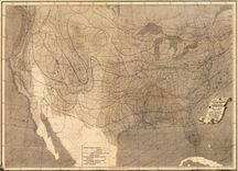
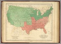
The Cotton Kingdom
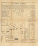
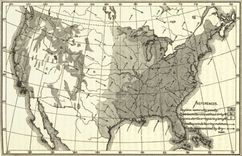
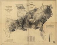
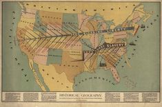
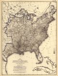
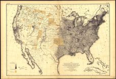
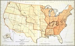
Atkinson designed this map to convince northerners to embrace the Emancipation Proclamation as a path to a more efficient system of free labor.
63 creators found
Atkinson designed this map to convince northerners to embrace the Emancipation Proclamation as a path to a more efficient system of free labor.
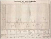
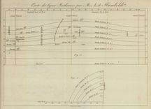
Barton designed this longitudinal chart to study the relationship between yellow fever and other aspects of city life, including weather and seasonal changes.
Barton compiled this complex map to locate the origin of the yellow fever outbreak of 1853, even noting the arrival of ships in the city port.
The Army collected extensive data regarding the health of Union soldiers during the Civil War, and thereafter Congress funded the effort to translate this information into cartographic form.
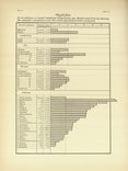
This is one of several charts that Baxter designed to showcase data collected during the war, a measurement technique that quickly became part of the new field of anthropology.
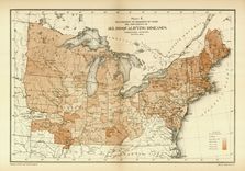
This map was one of several designed to investigate the background and fitness of the Union Army, as well as those men rejected by the draft.
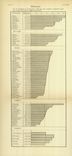
This is one of several charts that Baxter designed to showcase data collected during the war, a measurement technique that quickly became part of the new field of anthropology.
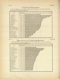
Baxter used this chart to search for patterns of illness among those rejected for service in the Union Army.
Inspired by the nation’s centennial, Blanchard used both new and facsimile maps to showcase the history of exploration.
This is one of five charts of temperature designed by Lorin Blodget, the first made in the United States and derived from decades of research collected by the Smithsonian Institution.
This annual chart of temperature, designed and compiled by Lorin Blodget, was one of the earliest work by the famed lithographer Julius Bien.
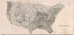
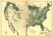
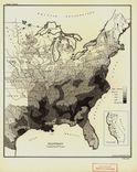
Blodget published several maps of seasonal and annual rainfall, the result of decades of observations collected by the Smithsonian, the Army, and other federal agencies.
Blodget published several maps of seasonal and annual rainfall, the result of decades of observations collected by the Smithsonian, the Army, and other federal agencies.
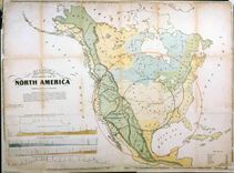
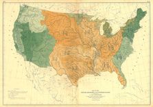
Francis Walker took care to include the latest maps of the physical landscape in his Statistical Atlas, in order to set the stage for the comprehensive population maps that would follow.
The international cholera epidemic of 1832 encouraged Brigham, and many others, to adopt maps to analyze the source and path of the disease.
Buckler adopted a cartographic approach to the cholera outbreak of 1849 by mapping the pattern of disease in the city as well as within the alms house.
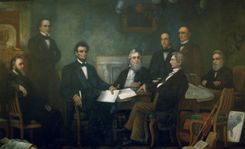
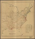
In this iconic portrait, Carpenter carefully reproduced the Coast Survey’s map of slavery in the lower right corner after noticing Lincoln’s attention to it.
Denison designed several maps to promote migration to the Front Range, including this one touting the health benefits of Colorado’s climate.
Disturnell was one of many to adopt Humboldt’s isotherm lines, here used alongside other measures to study “civilization” in North America.
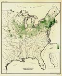
By the 1860s mapping agriculture had become commonplace, and spread quickly in the twentieth century.
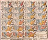
Donnell’s chart of presidential elections incorporates a tremendous amount of data, and is designed to illustrate the process of geographical expansion and the fluidity of political power.
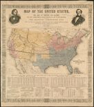
One of many maps created for the 1856 election. The dark lines across the interior represent the expeditions of John Fremont, Republican candidate for president.
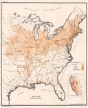
Forry, a physician, made the first map of climate patterns at the request of the Surgeon General, to study the relationship between geography and disease.
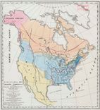
By using the same base map to identify several different ethnic groups, Walker enabled the viewer to draw connections about patterns of migration and settlement.
Gilpin designed this to shift the nation’s center of gravity westward toward the neglected interior, just as the nation acquired new territories in 1848
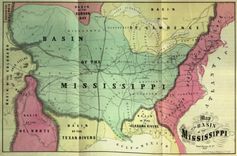
Gilpin emphasized geographical relationships to showcase the “great basin” of the interior, which he predicted would soon become the economic, political, and demographic center of the nation.
Gilpin adopted Humboldt’s lines to “demonstrate” that the U.S. was destined for economic and political supremacy.
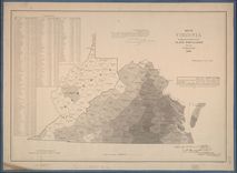
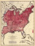
The final edition of the Virginia slave map used Census data to pointedly illustrate the relative absence of slaves from the western half of the state.
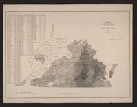
The Coast Survey executed this map just as Virginians were debating secession in order to highlight the different interests around slavery in the state.
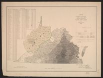
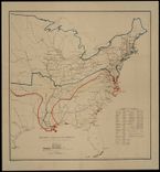
The Coast Survey’s second map of Virginia was modified to reflect to growing division in that state during the secession crisis. Note the identification of “Kanawha.”
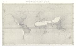
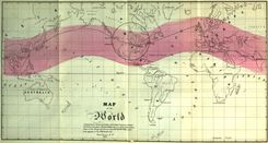
Guyot adapted this map to illustrate the dramatic differences of rainfall around the world, collapsing extensive data onto a single image.
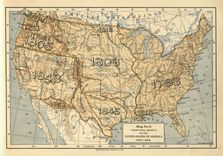
This type of map became popular in American schools in the late nineteenth century, a powerful visual depiction of the nation’s historical expansion and ideas of manifest destiny.
Notice that Joseph Henry uses this map to integrate several different aspects of the environment, including rainfall, woodland, and prevailing winds.
With this and other physical maps, Census Superintendent Francis Walker revealed his interest in thinking about the population in the widest possible terms.
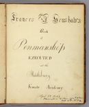
Henshaw was a student at the Middlebury Female Academy, and her journal reveals much about contemporary lessons in geography and penmanship.
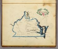
Here Henshaw traced a map of Virginia to practice penmanship and learn geography.

Alongside each hand-drawn state map, Henshaw visually rendered a description of each state to inscribe it in her memory.
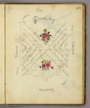
Henshaw’s picture of Kentucky indicates that she was taught to arrange material geographically, the same spatial approach to learning promoted by Emma Willard.
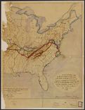
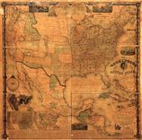
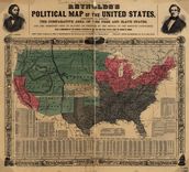
One of the first American attempts to translate the census into cartographic form, and a favorite of President Lincoln during the Civil War.
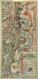
This is the Coast Survey’s prototype for a map that captured the state of the rebellion in spring 1862. Note the detailed legend in the lower left marking battle sites and troop routes.
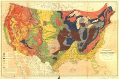
This stunning map owed much to its antebellum maps of geology as well as the fine chromolithography of Julius Bien.
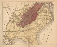
These maps date from the 1870s, and indicate Hotchkiss’ interest in thematic mapping to promote Virginia after the Civil War.
Notice that Hotchkiss—a well-respected cartographer for the Confederacy—incorporated Hilgard’s “center of population” map in order to promote the centrality of Virginia after the Civil War.
Hotchkiss separated out the black population in this map of Virginia, and made notations regarding improvements. His data was taken from Walker’s Statistical Atlas.
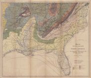
Here is one of several original maps designed by Hotchkiss to promote the mineral wealth of the region, taken from his journal The Virginias.
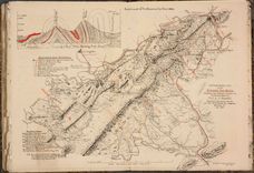
Hotchkiss created this to lure capital to the region for mining and railroads alike. Note the candor in the lower left corner, and the attention to topographical detail.
Here is one of the many attempts to represent American history in graphic terms that flourished in the wake of the nation’s centennial, and which was updated in 1894.
Humboldt devised this chart to represent lines of equal temperature, which enabled observers to think about the relationship between temperature patterns and other phenomena.
Here Johnston distinguished between states important and exporting slaves in order to convey areas of growth and decline in the south.
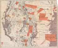
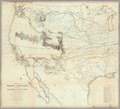
The Commissioner of Indian Affairs requested this map to represent the state of western development, highlighting land, mineral riches, and railroads.
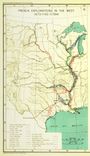
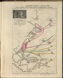
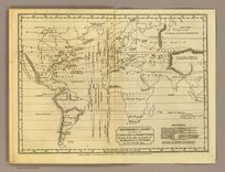
Kohl innovated the use of color along the coasts to indicate the stages of discovery along the coast as well as the interior.
Kohl’s map of the east coast used vibrant color to depict phases of exploration as waves upon the shore. Note his careful discussion on the map of the voyages of Sebastian Cabot.
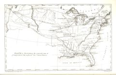
Here Kohl carefully identified river voyages as well as coastal discovery, from the sixteenth century to his own day
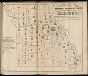
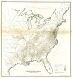
Leigh designed several maps to demonstrate the relative inefficiency of slave labor in Missouri, yet this includes so much information as to be difficult to understand.
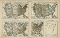
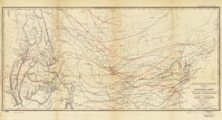
The Coast Survey published several of these maps during the war, each of which detailed the progress of Union control as well as the relative population of the loyal and insurgent states.
Each of these “sketches” attempted to tell the story not just of the latest state of affairs, but the progress over the war over time.
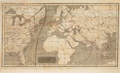
Mallet designed this complex map to guide the British as they developed cotton in India, drawing on existing geological and environmental maps from the era.
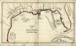
Maury compiled this massive wall map to showcase new thematic maps on the eve of the Civil War, which appear along the lower edge of the map.
The “Washington Map” was continually updated through the 1860s to reflect the availability of new information, as with the Eighth Census of 1860.
The Coast Survey’s map of slavery inspired several variations, including this map illustrating a military strategy to defeat the Confederacy.
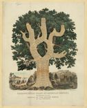
Dalston’s chart is a variation on Emma Willard’s tree of time, and detailed early growth in the roots out to recent developments in the branches. Note the stages of social progress.
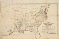
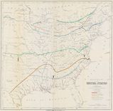
Olmsted issued this map in the midst of the secession crisis to convince the British to withhold support for the Confederacy; it is the first attempt to measure cotton production on a map.
This map adopted techniques used almost a century earlier by Johann Kohl to represent the stages of discovery through the use of color.
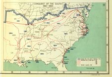
Here the Civil War is represented in stages, as popularized by Henry Lindenkohl and the U.S. Coast Survey in the “Sketches of the Rebellion,” included above.
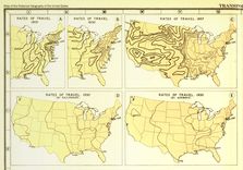
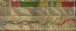
Here Charles Paullin represented advances in transportation technology in geographic terms in order to depict the qualitative changes over the course of American history.
Geographer John Wright devised these maps to represent the dynamism of agricultural growth in American history. Each map represents change over a ten year period.
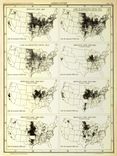
Geographer John Wright devised these maps to represent the dynamism of agricultural growth in American history. Each map represents change over a ten year period.
Geographer John Wright devised these maps to represent the dynamism of agricultural growth in American history. Each map represents change over a ten year period.
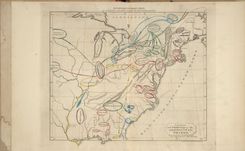
A European was the first to map American census data. The map at lower left shades the density of the slave population, and identifies the number of slaves per square mile.
Large and detailed depictions like this were popular in schools and homes; note the depiction of landscapes and “female costumes” to represent geography.
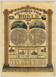
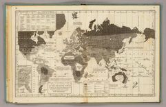
This broadside also attempted to capture a wide range of information, including world topography, and graphs that charted world chronology and the lives of distinguished men.
At left is Ramsay’s map of the new nation, accompanied by his attempt to “chart” the American past since 1607, directly inspired by the timelines of Joseph Priestley.
One of several maps made to promote Republican John Fremont’s campaign for president in 1856. Note that Kansas is highlighted, the center of violent conflict over slavery.
Baltimore’s city physician Thomas Buckler designed this map to study the pattern of cholera in 1849, particularly as it related to the city’s water supply and to the outbreak of fever.
Notice the zealously sectional interpretation of history in this map, especially the identification of northern liberty as emanating from Christianity, in contrast to southern slavery.

This graphic depiction of history evokes Emma Willard’s “picture of nations” a century earlier, and was one of Rand McNally’s most popular sellers in the twentieth century.
Steinwehr was one of several skilled mapmakers who emigrated to the U.S. prior to the Civil War. This map integrates steam and wind power with agriculture to measure productivity.
The use of lines to represent average temperatures spread quickly in the nineteenth century. Stevens’ chart is designed to promote a northern transcontinental railroad route in the 1850s.
The Philadelphia mapmaker Henry Tanner adapted his existing map of the U.S. to trace the cholera epidemic of 1832. Notice his use of red ink to identify the cities of the outbreak.
Frustrated by what he considered the flawed and misleading maps of cholera, Henry Tanner designed this world map to identify the geographic and chronological phases of the epidemic.
This map depicts the shrinking bison population, highlighting the effects of expansion at the nation’s centennial. It became the model for William Temple Hornaday’s well-known map of 1887.
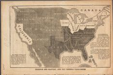
Anti-slavery activist John Jay used this map to alert northerners to the threat of slavery in the west, and to promote the cause of the newly-founded Republican Party in the 1856 presidential election.
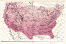
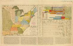
This is typical for its time: the title claims it as “statistical,” the data is simply listed on the map. Soon thereafter maps would begin to represent statistics through shading and other techniques.
Walker’s Statistical Atlas, with maps executed by Julius Bien, was one of the first of its kind, and continues to command attention for its path-breaking use of maps and graphic illustration.
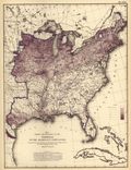
Here Walker introduced Americans to a new kind of map that mapped information. Here population density is outlined in blue ink, while the foreign population is shaded in color.
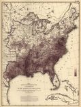
Like the map of the foreign population above, this one was one of the first that enabled the viewer to think about the African American population in reference to the population as a whole.
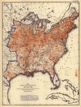
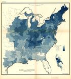
Walker integrated population density with this map of wealth to enable viewers to see possible relationships between the two.
Here Walker used a map to compare the distribution of two classes of information (rates of illiteracy and population density), introducing what is now a common analytical use for maps.
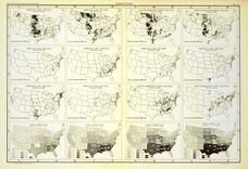
Walker chose several categories to map, including the incidence of different diseases and their relative effect on death rates.
Walker served as Commissioner of the Indian Bureau while also Superintendent of the Ninth Census in the 1870s, and in both capacities relied on maps.
Julius Hilgard innovated the technique of identifying the “center” of population at each decennial census, which had a profound effect on Frederick Jackson Turner’s concept of the frontier.
Walker’s map of population density established the categories that would be used on all his subsequent population maps in blue ink, enabling viewers to compare classes of information.
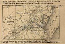
This map illustrated the black population in absolute terms rather than as a proportion of the overall population, as the Coast Survey’s map of slavery in 1861 had done.
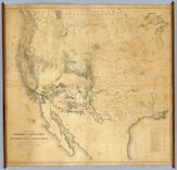
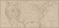
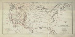
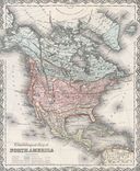
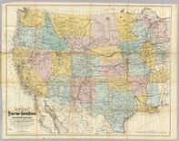
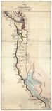
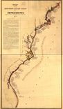
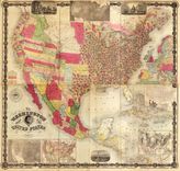
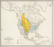
This was one of the first comprehensive maps of the maps, considered the most authoritative for years after it was compiled in connection with the railroad surveys of the 1850s.
This is one of the first comprehensive maps of the west, considered the most authoritative for several decades, and prompted by the railroad surveys of the 1850s.
Willard designed this comprehensive “picture of nations” to capture the advent of different civilizations, from the beginnings of recorded history down to her own day.
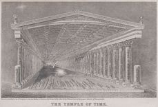
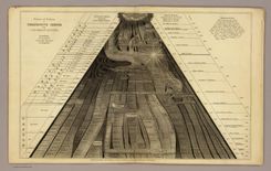
Willard designed this graphic to teach the relationship between geography and history: the ceiling marks individuals, coordinated by pillars of time and the growth of nations on the floor.
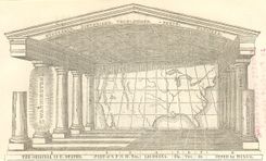
In the American edition, Willard drew the outline of the continental nation as the backdrop, and asked students to detail the nation’s history and geography on the floor, ceiling, and pillars.
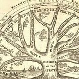
Willard used a tree to depict American history as a unified whole even as the nation was descending into Civil War. Though designated a history of the “U. States,” it begins with Columbus.
This map opened one of the first historical atlases of America, created by the noted educator Emma Willard. Note that she marked not just the location of tribes, but their migration over time.
Willard’s second map in the atlas marked the earliest voyages to America, and took pains to represent change over time. Note the inclusion of failed voyages and settlements..
In her final map of the historical atlas, Willard proudly asserted the admission of new states in the trans-Mississippi west, and detailed the transfer of territory from native tribes to the Union.
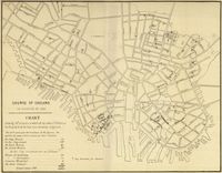
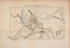
This is one of many examples of a map designed for etiological purposes, in this case to locate the source of the city’s 1849 cholera epidemic.
By mapping the distribution of wealth, disease, literacy, and other characteristics, Walker gave Americans entirely new ways to think about their nation.
The abbreviations on this map refer to Francis Walker’s comprehensive narrative, which detailed the territorial growth of the nation, from the colonial era down to his own day.
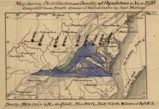
This was one of Walker’s first attempts to map census data, and contemporaries noticed the stark comparison between it and the map of the “colored population” from the same report.
Here designed this early map of the 1870 census convince Congress to fund an atlas of the census. Walker’s decision to map density reflected his concern with the growth of urbanization.
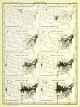
Francis Amasa Walker’s census maps of ethnicity were tailored to each group, and starkly illustrated their patterns of settlement in different parts of the country.
Here Walker mapped ethnic groups in density per square mile; later he would improve on this technique by adding the density of the overall population in order to facilitate comparison.
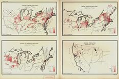
Walker paid close attention to mapping ethnic groups within the U.S., and these efforts became even more sophisticated in the Statistical Atlas of 1874.
Walker applied the new thematic mapping techniques from Europe to every aspect of American life that he could quantify, including disease, wealth, literacy, and ethnicity.
This was one of Walker’s first attempts to map disease data, by measuring deaths from consumption against deaths in the total population.
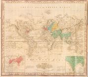
Woodbridge devised this world map to represent not topographic detail, but social, cultural, and political geography.
This chart adopted Alexander von Humboldt’s innovation of isothermal lines in order to enable students to investigate the relationship between temperature and agricultural output.