
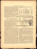
The Presidential Elections of the United States
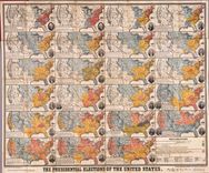
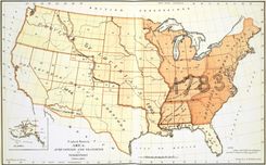
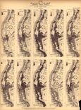
Donnell’s chart of presidential elections incorporates a tremendous amount of data, and is designed to illustrate the process of geographical expansion and the fluidity of political power.
36 maps found
Donnell’s chart of presidential elections incorporates a tremendous amount of data, and is designed to illustrate the process of geographical expansion and the fluidity of political power.
Here is one of the many attempts to represent American history in graphic terms that flourished in the wake of the nation’s centennial, and which was updated in 1894.
Inspired by the nation’s centennial, Blanchard used both new and facsimile maps to showcase the history of exploration.
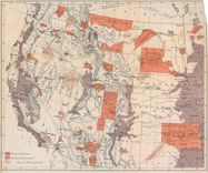
Denison designed several maps to promote migration to the Front Range, including this one touting the health benefits of Colorado’s climate.
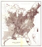
By mapping the distribution of wealth, disease, literacy, and other characteristics, Walker gave Americans entirely new ways to think about their nation.
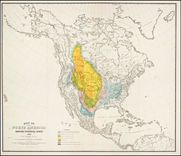
The abbreviations on this map refer to Francis Walker’s comprehensive narrative, which detailed the territorial growth of the nation, from the colonial era down to his own day.
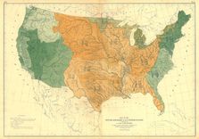
With this and other physical maps, Census Superintendent Francis Walker revealed his interest in thinking about the population in the widest possible terms.

Walker’s Statistical Atlas, with maps executed by Julius Bien, was one of the first of its kind, and continues to command attention for its path-breaking use of maps and graphic illustration.
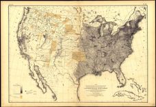
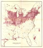
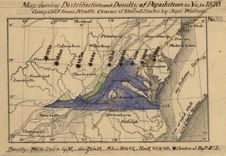
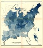
Walker’s map of population density established the categories that would be used on all his subsequent population maps in blue ink, enabling viewers to compare classes of information.
Here Walker introduced Americans to a new kind of map that mapped information. Here population density is outlined in blue ink, while the foreign population is shaded in color.
Walker integrated population density with this map of wealth to enable viewers to see possible relationships between the two.
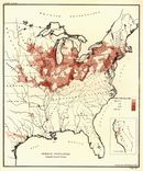
Here Walker used a map to compare the distribution of two classes of information (rates of illiteracy and population density), introducing what is now a common analytical use for maps.
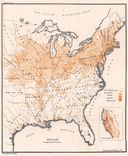
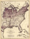
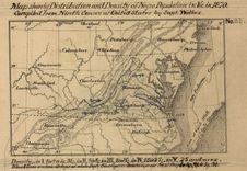
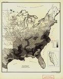
This was one of Walker’s first attempts to map census data, and contemporaries noticed the stark comparison between it and the map of the “colored population” from the same report.
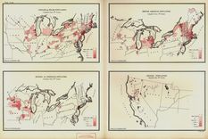
By using the same base map to identify several different ethnic groups, Walker enabled the viewer to draw connections about patterns of migration and settlement.
Walker served as Commissioner of the Indian Bureau while also Superintendent of the Ninth Census in the 1870s, and in both capacities relied on maps.
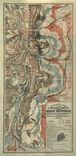
This map depicts the shrinking bison population, highlighting the effects of expansion at the nation’s centennial. It became the model for William Temple Hornaday’s well-known map of 1887.
Steinwehr was one of several skilled mapmakers who emigrated to the U.S. prior to the Civil War. This map integrates steam and wind power with agriculture to measure productivity.
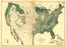
Francis Walker took care to include the latest maps of the physical landscape in his Statistical Atlas, in order to set the stage for the comprehensive population maps that would follow.
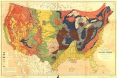
This stunning map owed much to its antebellum maps of geology as well as the fine chromolithography of Julius Bien.
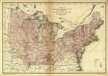
The Army collected extensive data regarding the health of Union soldiers during the Civil War, and thereafter Congress funded the effort to translate this information into cartographic form.
This is one of several charts that Baxter designed to showcase data collected during the war, a measurement technique that quickly became part of the new field of anthropology.
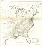
This map was one of several designed to investigate the background and fitness of the Union Army, as well as those men rejected by the draft.
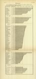
This is one of several charts that Baxter designed to showcase data collected during the war, a measurement technique that quickly became part of the new field of anthropology.
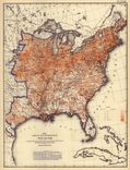
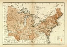
This map illustrated the black population in absolute terms rather than as a proportion of the overall population, as the Coast Survey’s map of slavery in 1861 had done.
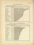
Baxter used this chart to search for patterns of illness among those rejected for service in the Union Army.
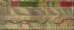
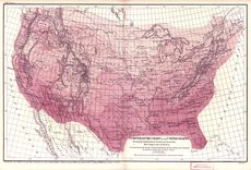
Julius Hilgard innovated the technique of identifying the “center” of population at each decennial census, which had a profound effect on Frederick Jackson Turner’s concept of the frontier.
These maps date from the 1870s, and indicate Hotchkiss’ interest in thematic mapping to promote Virginia after the Civil War.
Notice that Hotchkiss—a well-respected cartographer for the Confederacy—incorporated Hilgard’s “center of population” map in order to promote the centrality of Virginia after the Civil War.
Hotchkiss separated out the black population in this map of Virginia, and made notations regarding improvements. His data was taken from Walker’s Statistical Atlas.
Here is one of several original maps designed by Hotchkiss to promote the mineral wealth of the region, taken from his journal The Virginias.
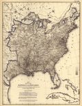
Here designed this early map of the 1870 census convince Congress to fund an atlas of the census. Walker’s decision to map density reflected his concern with the growth of urbanization.
Francis Amasa Walker’s census maps of ethnicity were tailored to each group, and starkly illustrated their patterns of settlement in different parts of the country.
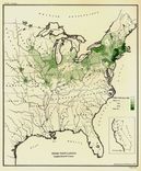
Here Walker mapped ethnic groups in density per square mile; later he would improve on this technique by adding the density of the overall population in order to facilitate comparison.
Walker paid close attention to mapping ethnic groups within the U.S., and these efforts became even more sophisticated in the Statistical Atlas of 1874.
Walker applied the new thematic mapping techniques from Europe to every aspect of American life that he could quantify, including disease, wealth, literacy, and ethnicity.
This was one of Walker’s first attempts to map disease data, by measuring deaths from consumption against deaths in the total population.