
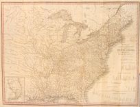
A Map Historical and Biographical Chart of the United States
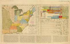
At left is Ramsay’s map of the new nation, accompanied by his attempt to “chart” the American past since 1607, directly inspired by the timelines of Joseph Priestley.
15 maps found
At left is Ramsay’s map of the new nation, accompanied by his attempt to “chart” the American past since 1607, directly inspired by the timelines of Joseph Priestley.
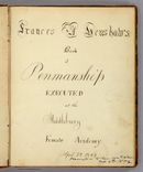
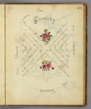
Henshaw was a student at the Middlebury Female Academy, and her journal reveals much about contemporary lessons in geography and penmanship.
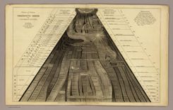
Willard designed this comprehensive “picture of nations” to capture the advent of different civilizations, from the beginnings of recorded history down to her own day.
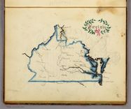
Here Henshaw traced a map of Virginia to practice penmanship and learn geography.
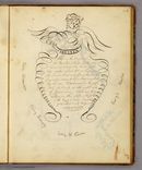
Alongside each hand-drawn state map, Henshaw visually rendered a description of each state to inscribe it in her memory.
Henshaw’s picture of Kentucky indicates that she was taught to arrange material geographically, the same spatial approach to learning promoted by Emma Willard.
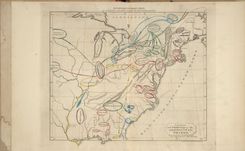
This map opened one of the first historical atlases of America, created by the noted educator Emma Willard. Note that she marked not just the location of tribes, but their migration over time.
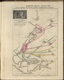
Willard’s second map in the atlas marked the earliest voyages to America, and took pains to represent change over time. Note the inclusion of failed voyages and settlements..
In her final map of the historical atlas, Willard proudly asserted the admission of new states in the trans-Mississippi west, and detailed the transfer of territory from native tribes to the Union.
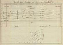
Humboldt devised this chart to represent lines of equal temperature, which enabled observers to think about the relationship between temperature patterns and other phenomena.
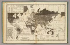
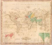
Woodbridge devised this world map to represent not topographic detail, but social, cultural, and political geography.
This chart adopted Alexander von Humboldt’s innovation of isothermal lines in order to enable students to investigate the relationship between temperature and agricultural output.
The international cholera epidemic of 1832 encouraged Brigham, and many others, to adopt maps to analyze the source and path of the disease.
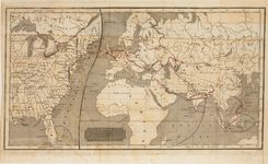
The Philadelphia mapmaker Henry Tanner adapted his existing map of the U.S. to trace the cholera epidemic of 1832. Notice his use of red ink to identify the cities of the outbreak.
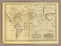
Frustrated by what he considered the flawed and misleading maps of cholera, Henry Tanner designed this world map to identify the geographic and chronological phases of the epidemic.