
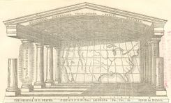
American Temple of Time
In the American edition, Willard drew the outline of the continental nation as the backdrop, and asked students to detail the nation’s history and geography on the floor, ceiling, and pillars.
21 maps found
In the American edition, Willard drew the outline of the continental nation as the backdrop, and asked students to detail the nation’s history and geography on the floor, ceiling, and pillars.
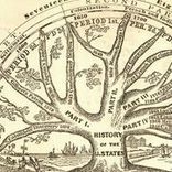
Willard used a tree to depict American history as a unified whole even as the nation was descending into Civil War. Though designated a history of the “U. States,” it begins with Columbus.
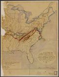
This is the Coast Survey’s prototype for a map that captured the state of the rebellion in spring 1862. Note the detailed legend in the lower left marking battle sites and troop routes.
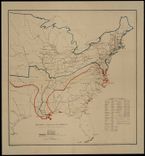
Each of these “sketches” attempted to tell the story not just of the latest state of affairs, but the progress over the war over time.
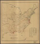
The Coast Survey published several of these maps during the war, each of which detailed the progress of Union control as well as the relative population of the loyal and insurgent states.
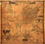
The “Washington Map” was continually updated through the 1860s to reflect the availability of new information, as with the Eighth Census of 1860.
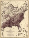
Disturnell was one of many to adopt Humboldt’s isotherm lines, here used alongside other measures to study “civilization” in North America.
By the 1860s mapping agriculture had become commonplace, and spread quickly in the twentieth century.
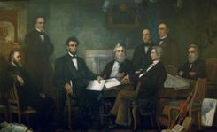
In this iconic portrait, Carpenter carefully reproduced the Coast Survey’s map of slavery in the lower right corner after noticing Lincoln’s attention to it.
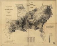
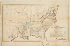
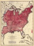
One of the first American attempts to translate the census into cartographic form, and a favorite of President Lincoln during the Civil War.
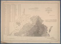
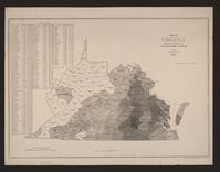
The final edition of the Virginia slave map used Census data to pointedly illustrate the relative absence of slaves from the western half of the state.
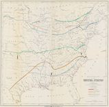
The Coast Survey’s map of slavery inspired several variations, including this map illustrating a military strategy to defeat the Confederacy.
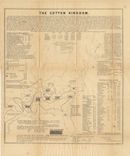
Olmsted issued this map in the midst of the secession crisis to convince the British to withhold support for the Confederacy; it is the first attempt to measure cotton production on a map.
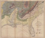
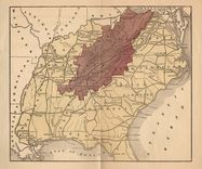
Mallet designed this complex map to guide the British as they developed cotton in India, drawing on existing geological and environmental maps from the era.
Atkinson designed this map to convince northerners to embrace the Emancipation Proclamation as a path to a more efficient system of free labor.
The Coast Survey executed this map just as Virginians were debating secession in order to highlight the different interests around slavery in the state.
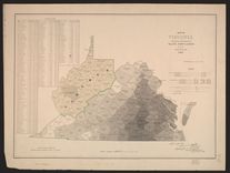
The Coast Survey’s second map of Virginia was modified to reflect to growing division in that state during the secession crisis. Note the identification of “Kanawha.”
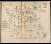
Leigh designed several maps to demonstrate the relative inefficiency of slave labor in Missouri, yet this includes so much information as to be difficult to understand.
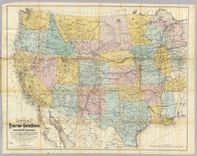
The Commissioner of Indian Affairs requested this map to represent the state of western development, highlighting land, mineral riches, and railroads.
Like the map of the foreign population above, this one was one of the first that enabled the viewer to think about the African American population in reference to the population as a whole.
Walker chose several categories to map, including the incidence of different diseases and their relative effect on death rates.