
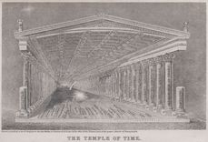
The Temple of Time
Willard designed this graphic to teach the relationship between geography and history: the ceiling marks individuals, coordinated by pillars of time and the growth of nations on the floor.
31 maps found
Willard designed this graphic to teach the relationship between geography and history: the ceiling marks individuals, coordinated by pillars of time and the growth of nations on the floor.
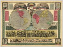
Large and detailed depictions like this were popular in schools and homes; note the depiction of landscapes and “female costumes” to represent geography.
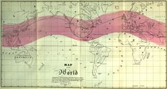
This broadside also attempted to capture a wide range of information, including world topography, and graphs that charted world chronology and the lives of distinguished men.
Kohl innovated the use of color along the coasts to indicate the stages of discovery along the coast as well as the interior.
Kohl’s map of the east coast used vibrant color to depict phases of exploration as waves upon the shore. Note his careful discussion on the map of the voyages of Sebastian Cabot.
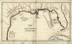
Here Kohl carefully identified river voyages as well as coastal discovery, from the sixteenth century to his own day
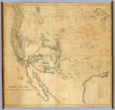
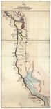
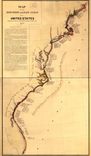
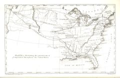
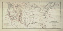
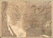
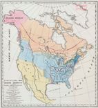
This was one of the first comprehensive maps of the maps, considered the most authoritative for years after it was compiled in connection with the railroad surveys of the 1850s.
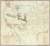
This is one of the first comprehensive maps of the west, considered the most authoritative for several decades, and prompted by the railroad surveys of the 1850s.
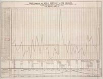
Barton designed this longitudinal chart to study the relationship between yellow fever and other aspects of city life, including weather and seasonal changes.
Forry, a physician, made the first map of climate patterns at the request of the Surgeon General, to study the relationship between geography and disease.
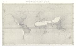
Guyot adapted this map to illustrate the dramatic differences of rainfall around the world, collapsing extensive data onto a single image.
This is one of five charts of temperature designed by Lorin Blodget, the first made in the United States and derived from decades of research collected by the Smithsonian Institution.
This annual chart of temperature, designed and compiled by Lorin Blodget, was one of the earliest work by the famed lithographer Julius Bien.
Blodget published several maps of seasonal and annual rainfall, the result of decades of observations collected by the Smithsonian, the Army, and other federal agencies.
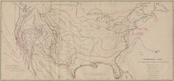
Notice that Joseph Henry uses this map to integrate several different aspects of the environment, including rainfall, woodland, and prevailing winds.
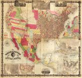
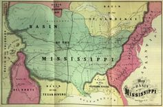
Maury compiled this massive wall map to showcase new thematic maps on the eve of the Civil War, which appear along the lower edge of the map.
Blodget published several maps of seasonal and annual rainfall, the result of decades of observations collected by the Smithsonian, the Army, and other federal agencies.
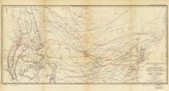
The use of lines to represent average temperatures spread quickly in the nineteenth century. Stevens’ chart is designed to promote a northern transcontinental railroad route in the 1850s.
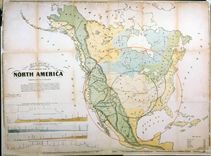
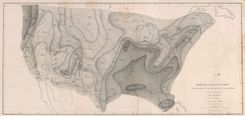
Gilpin designed this to shift the nation’s center of gravity westward toward the neglected interior, just as the nation acquired new territories in 1848
Gilpin emphasized geographical relationships to showcase the “great basin” of the interior, which he predicted would soon become the economic, political, and demographic center of the nation.
Gilpin adopted Humboldt’s lines to “demonstrate” that the U.S. was destined for economic and political supremacy.
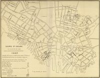
This is one of many examples of a map designed for etiological purposes, in this case to locate the source of the city’s 1849 cholera epidemic.
Baltimore’s city physician Thomas Buckler designed this map to study the pattern of cholera in 1849, particularly as it related to the city’s water supply and to the outbreak of fever.
Buckler adopted a cartographic approach to the cholera outbreak of 1849 by mapping the pattern of disease in the city as well as within the alms house.
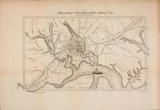
Barton compiled this complex map to locate the origin of the yellow fever outbreak of 1853, even noting the arrival of ships in the city port.
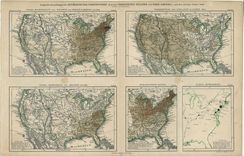
A European was the first to map American census data. The map at lower left shades the density of the slave population, and identifies the number of slaves per square mile.
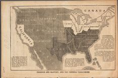
Anti-slavery activist John Jay used this map to alert northerners to the threat of slavery in the west, and to promote the cause of the newly-founded Republican Party in the 1856 presidential election.
This is typical for its time: the title claims it as “statistical,” the data is simply listed on the map. Soon thereafter maps would begin to represent statistics through shading and other techniques.
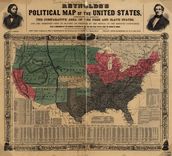
One of several maps made to promote Republican John Fremont’s campaign for president in 1856. Note that Kansas is highlighted, the center of violent conflict over slavery.
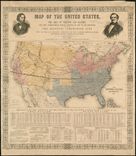
One of many maps created for the 1856 election. The dark lines across the interior represent the expeditions of John Fremont, Republican candidate for president.
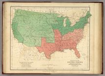
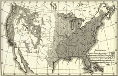
Here Johnston distinguished between states important and exporting slaves in order to convey areas of growth and decline in the south.