The legacy of Francis Amasa Walker: graphic, infographic, and cartographic
This past week I wrote a piece for Fast Company Design about the legacy of Francis Amasa Walker. As the Superintendent of the 9th Census in 1870, Walker took the Census in new directions. He proposed through several census reforms in the early 1870s, which ultimately succeeded in a decade later. But his most ambitious legacy was visualizing the results of the census in graphic and cartographic ways that not only illustrated the data, but transformed it into knowledge.
Walker’s work stands at the heart of my final chapter in Mapping the Nation, for he was able to rethink the possibilities of cartography so that data could be layered in a way that might answer questions about the national population and its resources. I’ve thought a lot over the years about what these statistical maps mean, and welcome your thoughts here.
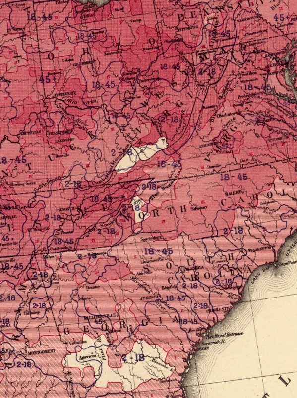
Walker’s primary interest was in layering classes of information–one of which was always general population density For instance, here is his map of predominating sex: the darker the shading, the larger the ratio of male to female residents. But notice also the blue numbering, which identifies overall population density. This allowed Walker to ask whether there was any correlation between general population density and the disproportion of men or women (or visa versa).

Click to open in new window.
In this case there does not seem to be a direct correlation, but Walker was intrigued by what this juxtaposition might reveal: for illiteracy, wealth, or ethnic and racial distribution.

Click to open in new window.
Similarly, here he uses the map to analyze the relationship between general population density and the incidence of consumption (tuberculosis). For Walker, the nation’s trend toward urbanization was potentially related to all kinds of maladies, but just as often his maps fail to bear out the correlation. In fact, he was experimenting with maps as a form of analysis.

Click to open in new window.
Walker’s maps were the progenitors of data mining, as well as modern Geographic Information System, which renders all kinds of data in spatial forms in order to reveal patterns for urban planning, marketing, political research, and the like. It’s thrilling and intriguing to think about what Walker and his colleagues were thinking about the potential uses for such spatial visualization in the 1870s. Most importantly, they thought it would open up entirely new realms of social scientific research, for questions might be revealed through these maps that otherwise would remain invisible. Walker’s own concerns were increasingly directed toward immigration in the late nineteenth century, but I’m certain there were all kinds of other applications, which we see flourish in the twentieth century. What Walker launched (with help from many others) was a new way of thinking about the population.
How else might these maps have been used? I’ve just begun to think through the possibilities.
Use controls to zoom and pan.
[…] (Via Mapping the Nation) […]
[…] (Via Mapping the Nation) […]
[…] (Via Mapping the Nation) […]
[…] Map of predominating sex (1872) | Francis Amasa Walker […]