Maps of Gilded Age San Francisco, Chicago, and New York
From the mid-1880s through the 1890s, reformers in San Francisco, Chicago, and New York experimented with maps to make sense of an exploding immigrant population. Considered together, what might these maps tell us about the rapid spread of data mapping after the Civil War? If nothing else, this represents an real moment in the use of maps for administrative goals, not unlike the proliferation of maps used to make sense of disease during the cholera and yellow fever epidemics of the 1840s and 1850s.
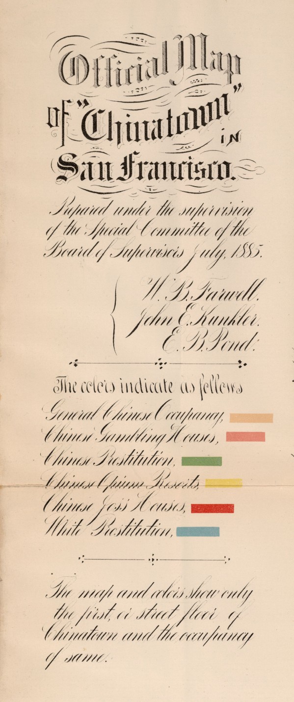
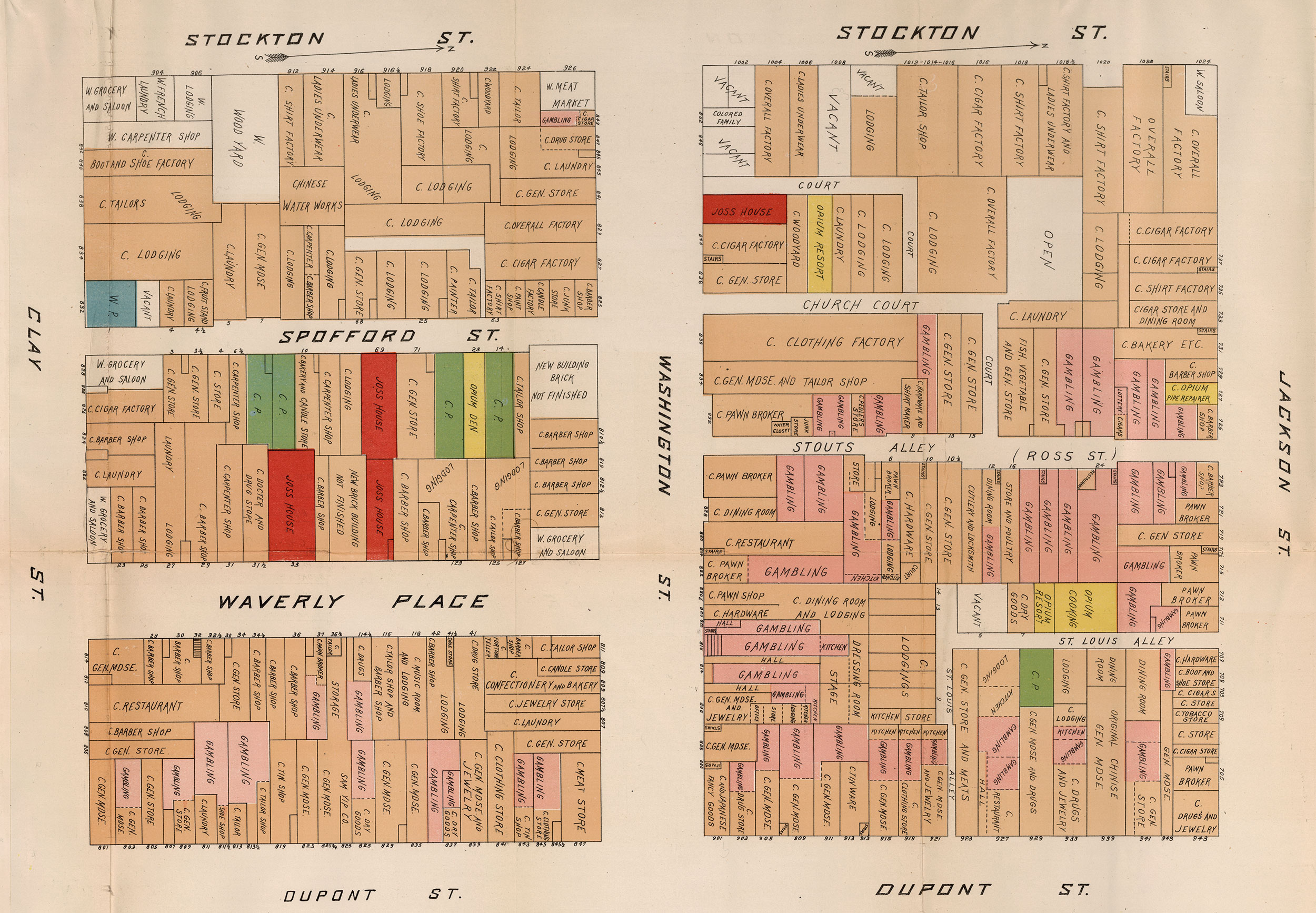
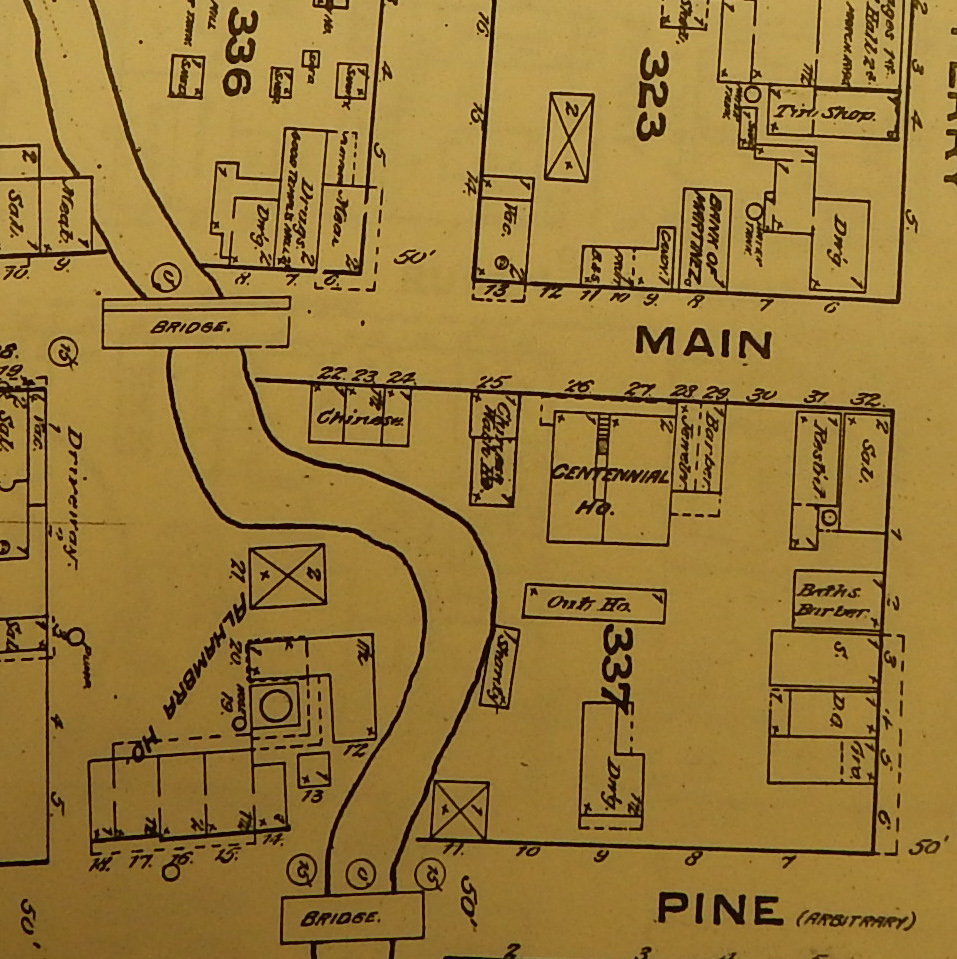
I’ve written before about the effort of San Francisco’s city fathers in the 1880s to investigate Chinatown, part of a larger statewide campaign to limit the mobility of the Chinese, and ultimately to halt their immigration entirely. The investigators took pains to create a lavishly colored map of vice in the neighborhood, and identified opium dens, gambling houses, places of worship, and houses of prostitution—carefully separating white from Chinese in this last category.
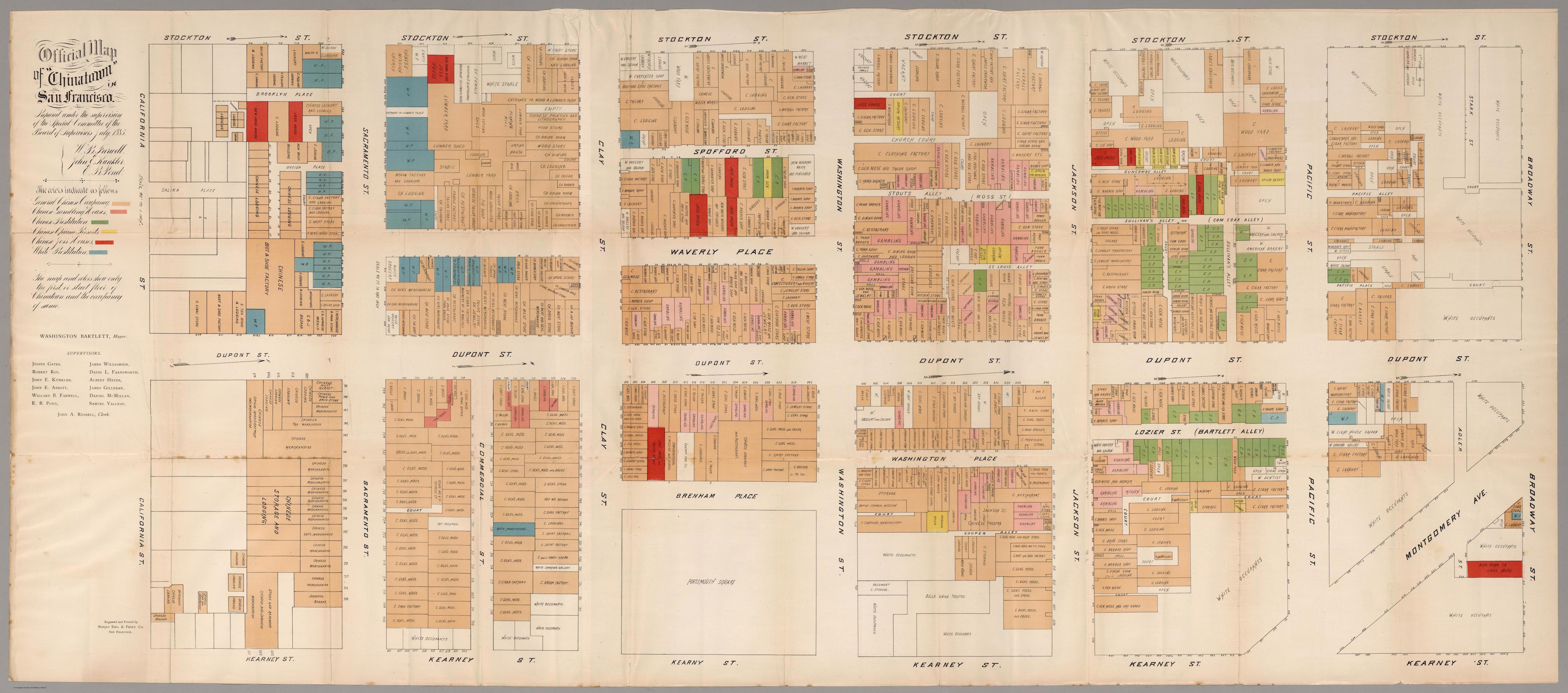
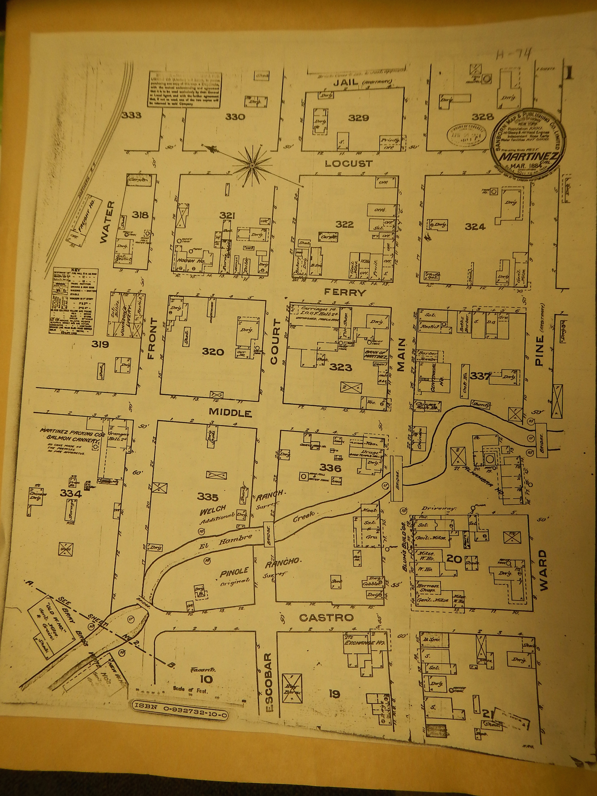
The Chinatown vice map was very much an outgrowth of contemporary Sanborn Fire Insurance Maps. Take this 1884 map of Martinez, California, from the Contra Costa Historical Society (thanks to Anthony Oertel). A careful look at the corner of Middle and Main Street shows “Chinese” dwellings and wash houses, just east of El Hombre Creek at Main.
Click to open in new window
Here is a detail of the Chinese structures.
Just a few years later, British reformer William Stead designed a similar map to dramatize the vice in the Midwest with If Christ Came to Chicago (1894). His map echoes the style and content of the Chinatown vice map, marking brothels and saloons, pawnbrokers and flop houses.
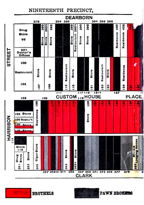
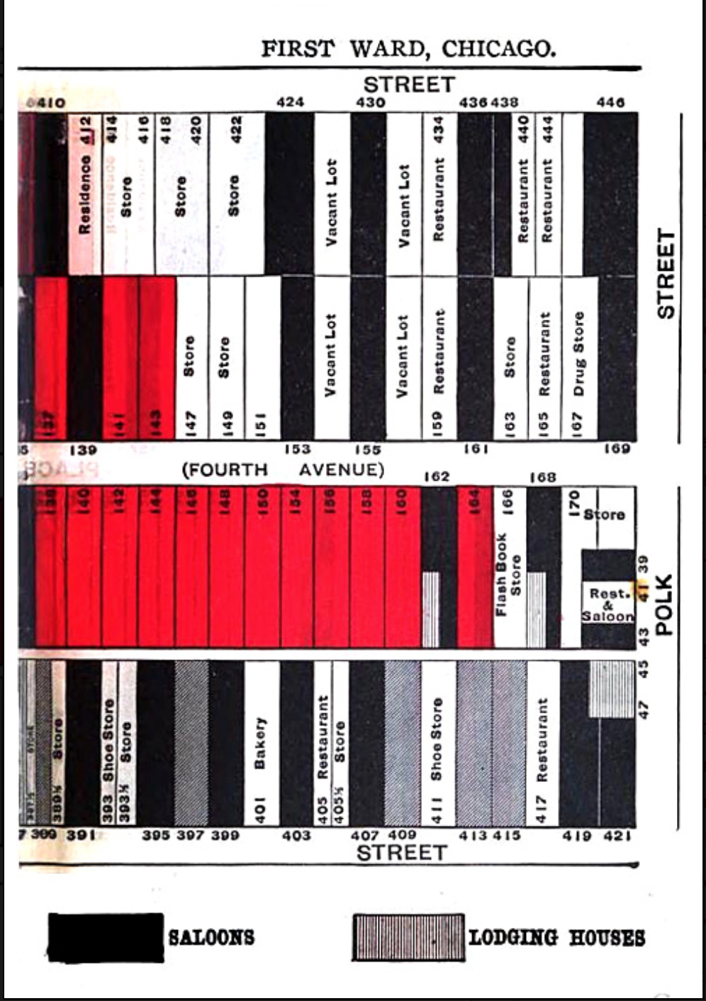
Stead’s 1894 map of Chicago, like that of the 1885 Chinatown map, is straightforward and simple, a bruising indictment of the impoverished civic and economic life of the city. It is itself an argument, rather than a tool of investigation or sociology that we see in so many of the emerging information maps of the era, particularly those pioneered by Francis Amasa Walker. This is not to say that the more data driven maps of Walker and others below lacked argument or agenda (quite the opposite). But my colleague Tim Spears at Middlebury College has aptly observed that the Stead map is a rhetorical statement (like the Chinatown map), a “sensational illustration masquerading as a scientific map.” In fact, Spears points out, it was the circulation and growing familiarity of Charles Booth maps of poverty and their categories that enabled Stead to use the same technique to a much more argumentative end. This urban mapping technique had become part of the vernacular.
At precisely the same moment of the early 1890s, Stead’s fellow Chicago reformers at the city’s Hull House turned to cartography to make sense of the welter of immigration on the south side.
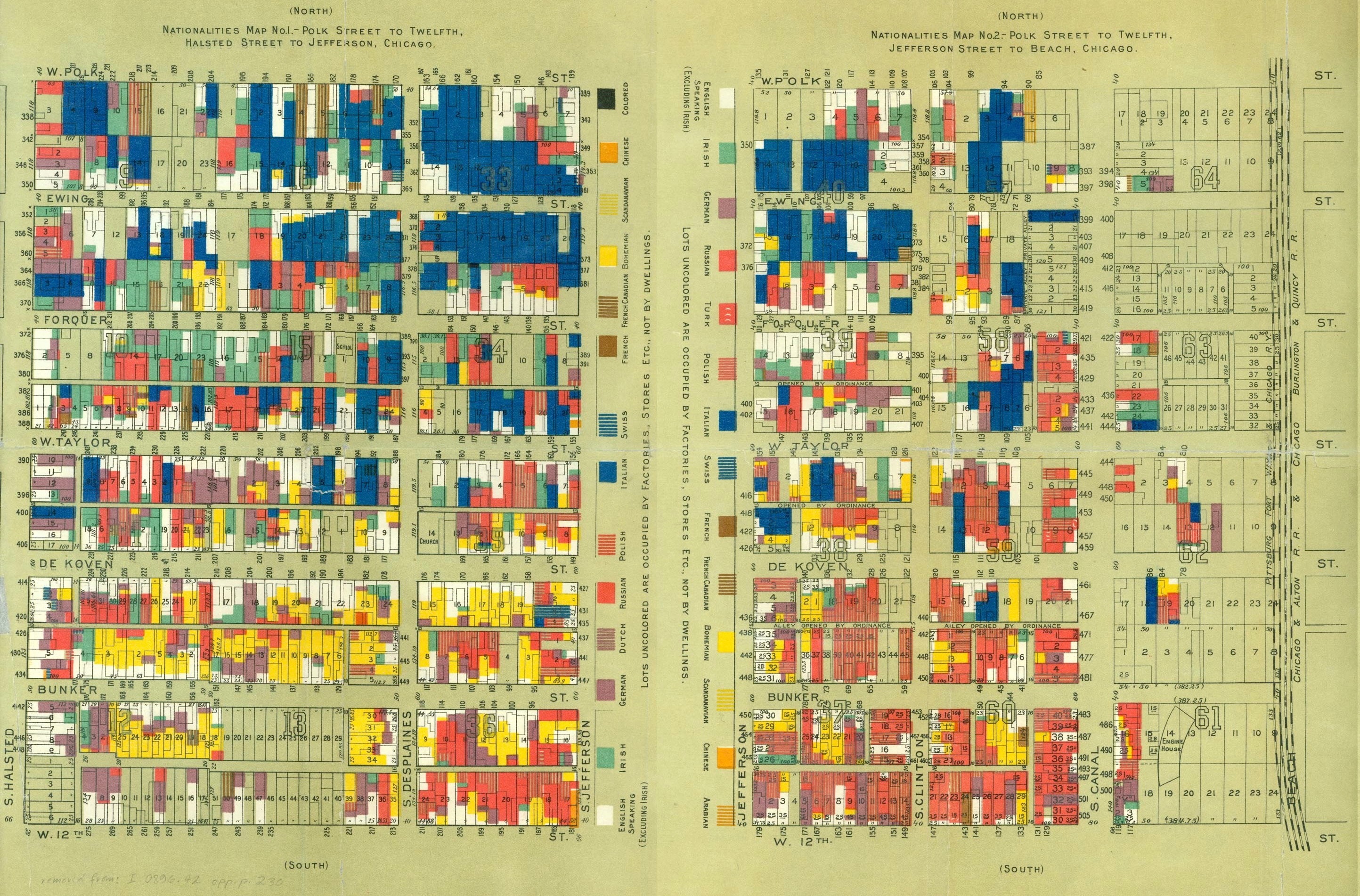
Click to open in new window.
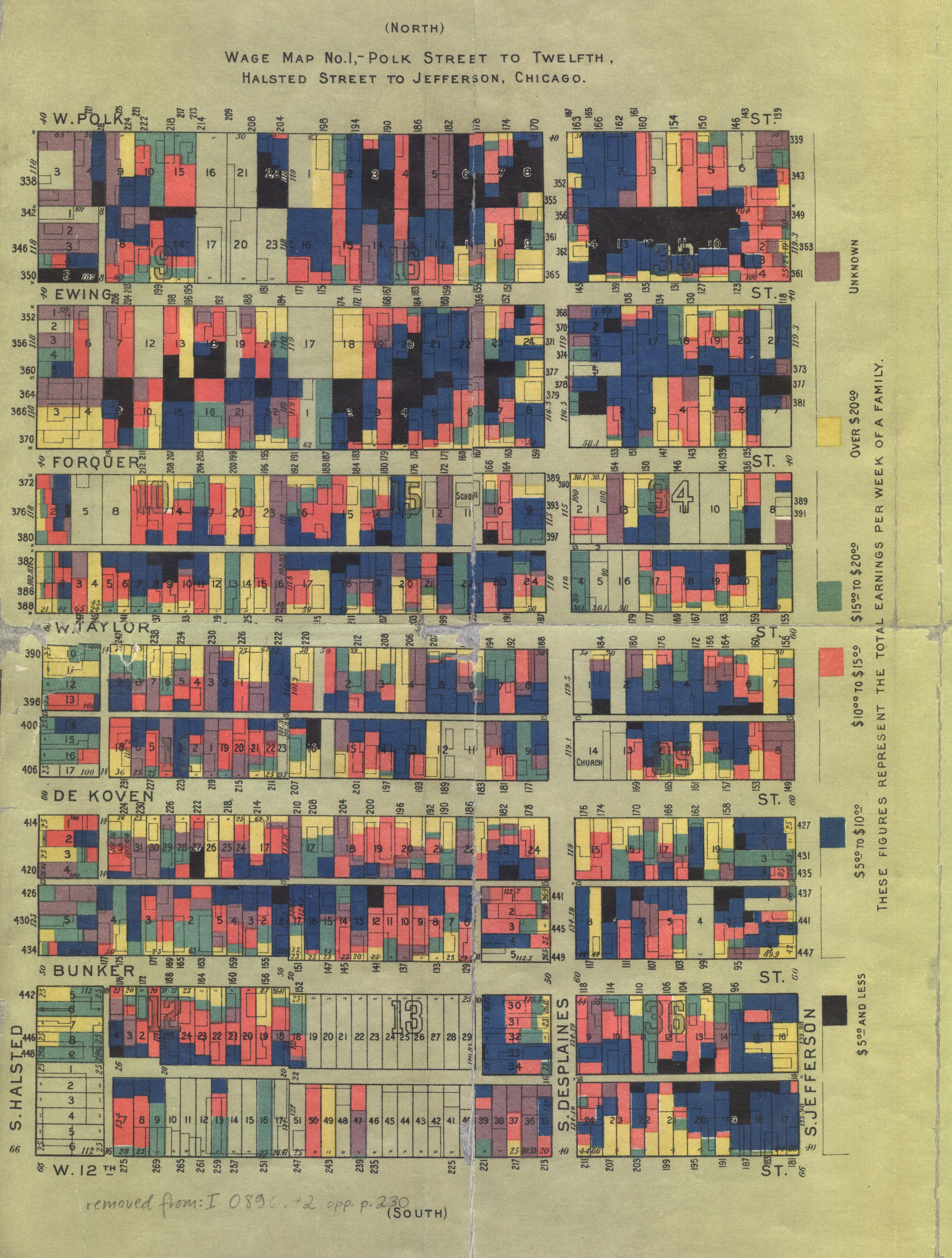
Click to open in new window.
Published in 1895, the maps were designed by Florence Kelley and Agnes Holbrook, and drew from the survey work done of Samuel Sewall Greely. Holbrook carefully documented the design and execution of the maps in Hull House Maps and Papers (1895), even including the extensive schedules and questionnaires used in their ground level investigation of each domicile and structure. And Jane Addams openly acknowledged Booth’s contemporary maps of poverty in London as the inspiration. But Kelley’s investigation of the slums in Chicago was also part of a nationwide effort to investigate the conditions of American cities, which may explain the “Tenement House” maps of New York, created in the summer of 1894 and published the following January, before the more famous Hull House maps.
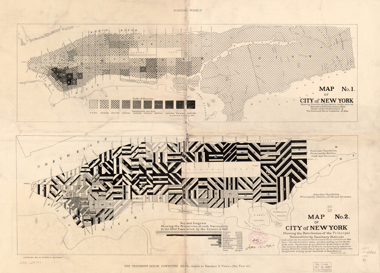
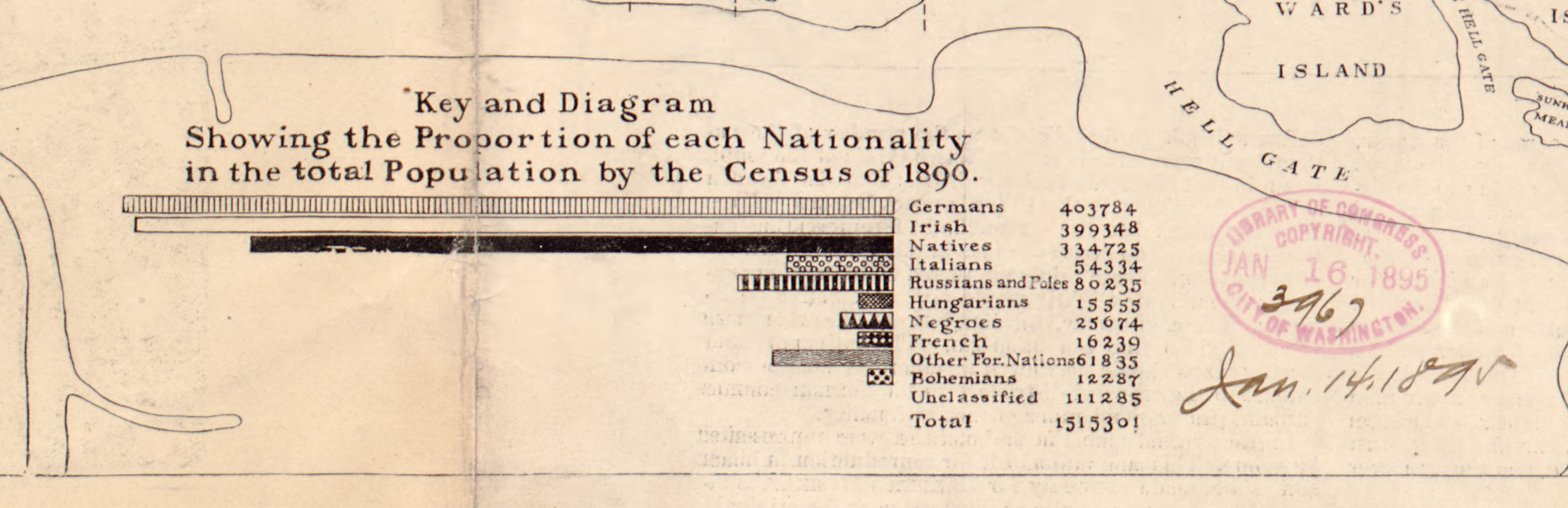
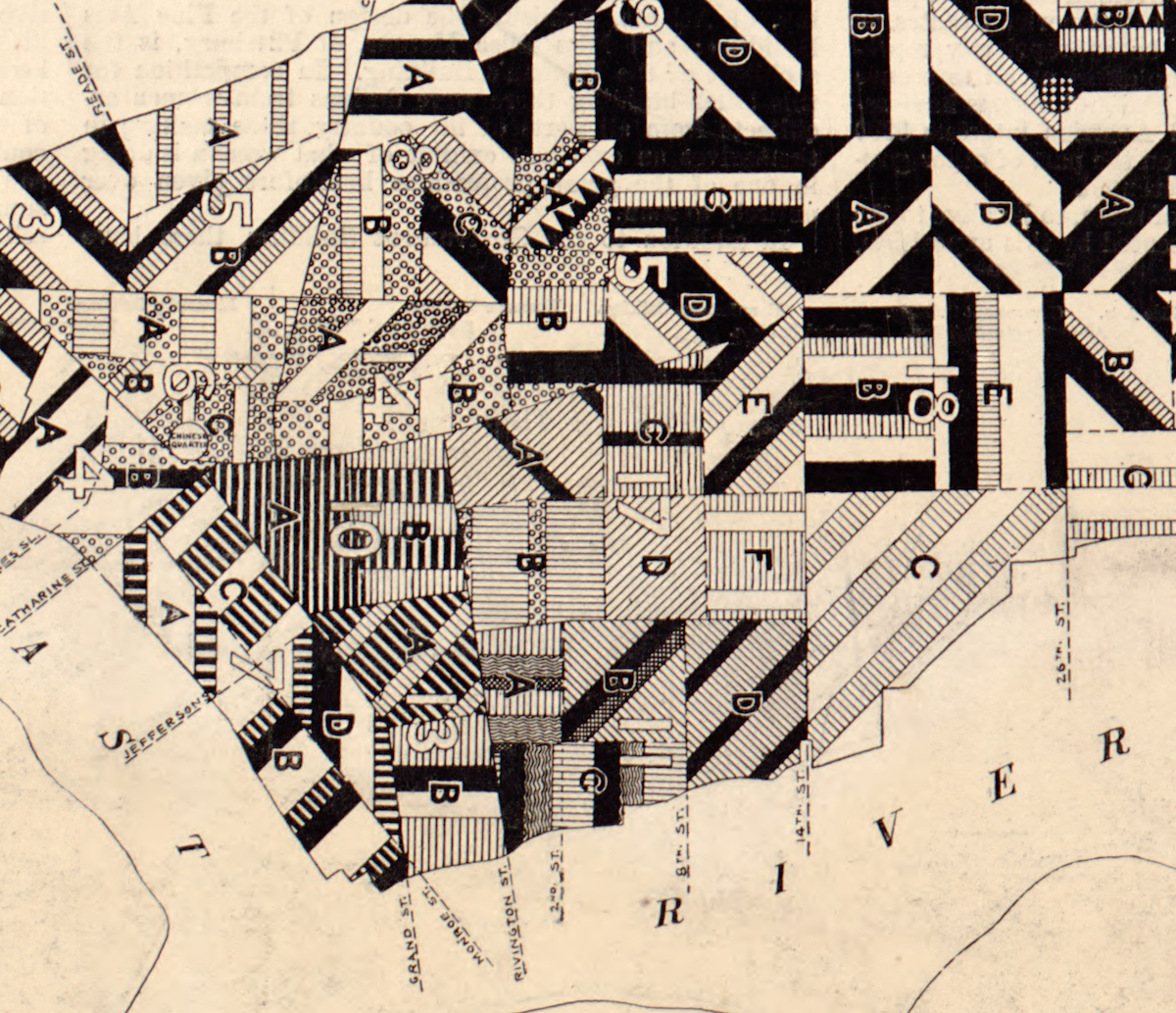
Designed by Frederick Erastus Pierce, these maps of the population were drawn from the 1890 Census, and represent yet another effort to use cartography to make sense of the unprecedented scale, density, and diversity of American cities at the end of the century. Pierce did this through four maps (two of which I’ve included here). While the Chicago maps of Hull House focus on the distribution of ethnicity as well as relative wages (and no attempt to map population density), here in New York the focus is entirely on population: its density and ethnic composition. The first identified the absolute population density in Manhattan, while the second creatively tried to map the ratio of various ethnic groups in each sanitary district. The result is simultaneously confounding and captivating, notable for its visual audacity and sheer commitment to detail (not to say accuracy).
Click to open in new window.
Click to open in new window.
Pierce chose to map some ethnic groups but not others, omitting the Scotch, English, Welsh, Scandinavian and Canadian, for they were less likely to settle together, and (tellingly) appeared “less foreign than the others.” He initially created the map in color, but had no such luxury when publishing the maps in Harper’s Weekly in January 1895. The effect, however, is still quite striking. Though not easy to follow, the maps are more valuable as a snapshot of the way that maps quickly spread as a language of information in the nineteenth century, and also as an emerging instrument of social science.
And taken together, there’s much more to explore here: how these techniques spread so quickly, across the Atlantic and across the United States, what they reveal about the relationship of mapping to reform and governance, and the emergence of a new visual language.
With thanks to John Krygier, who has impressively analyzed the Pierce maps from the perspective of a working cartographer.
Use controls to zoom and pan.