Mapping the efficiency of slave labor
Recently I wrote a piece for the Disunion series on Edward Atkinson, who creatively used a map to demonstrate the inefficiency of slave labor.
Atkinson is perhaps best known for his advocacy of free trade and his opposition to the expansionist policies of the McKinley Administration in the Spanish American War. But before he became a leading voice of economic reform in the Gilded Age, he was an ardent opponent of slavery. To be sure, this was not unusual for Bostonians in the 1850s and 1860s. What set Atkinson apart was his job: he was a leading cotton financier, and perhaps knew more than anyone else about the trade and manufacturing of cotton.
Thus, when Lincoln revealed his Emancipation Proclamation in September of 1862, Atkinson was both thrilled and also concerned: many of his colleagues were convinced that cotton could only be profitably cultivated through slave labor. Atkinson took it upon himself to convince them otherwise. In his view, slavery was not only morally wrong, but a violation of the free market. Above all else, he was convinced that it was simply inefficient. And he used this logic to convince his peers to support Lincoln’s fairly radical policy, one that utterly shifted the meaning of the Civil War.
To make his case, Atkinson wrote a pamphlet (this guy loved pamphlets, and published several of them on economics and anti-imperialism in later decades). He argued that the amount of land under cultivation through slavery paled next to what was possible if the market was open to free labor. He argued that cotton could in fact expand, and be profitably cultivated over a much larger geographic area.
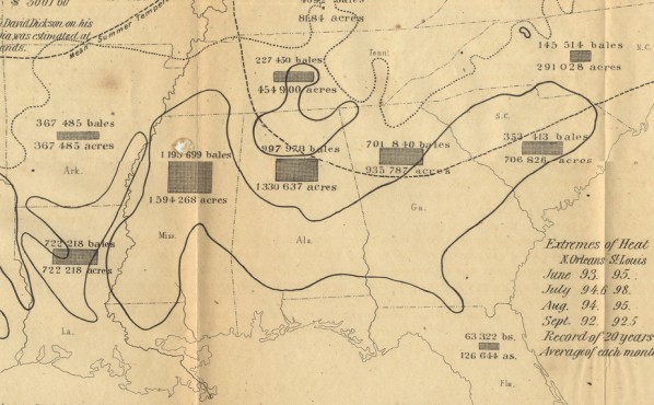
Perhaps the most convincing element of his case was an unusual map, one that was used to measure the productivity of slavery. Here is the entire map, followed by some detailed crops. Notice that Atkinson analyzes the productivity of some individual plantations, arguing that forced labor is invariably less productive and more expensive than free labor. I don’t want to endorse his arguments–there is a longstanding debate on the economic profitability of slavery. My point is purely cartographic: he resorted to a map to make a case that involved measuring many variables.

Click to open in new window.
I’ve seen other maps prior to this intended to measure particular problems or social phenomena: think of maps of crime made in France in the 1830s, or of disease made in the U.S. and across Europe in the 1840s and 1850s. I wonder if there are other examples out there just waiting to be discovered, of maps explicitly used not to describe the seen landscape, but to measure something unseen, or to dissect a problem. To me this use of maps represents a fundamental shift in the nineteenth century.
Notice, for instance, how Atkinson integrates more than one type of information onto the map. In the detail below, you can see he’s using the latest technique of line (the dotted ones) to represent average summer temperatures, in order to argue for the expansion of cotton cultivation.

Click to open in new window.
The dark lines represent the current area of intense cotton cultivation. Perhaps the most convincing (or alarming) graphic technique is the use of boxes to measure the relative size of each state devoted to cotton production. Many who had heard southern partisans invoke the “Cotton Kingdom” in the 1850s were surely surprised to find that in fact a far smaller portion of the south was devoted to agriculture than the northeast or the emerging Midwest.

What I love is this emerging sense that a map can be used as an instrument. Though this was surely not new, in the nineteenth century these maps could be made, revised, printed, and distributed with increasing ease, which meant they were quickly adopted by lots of different fields. Chapter four of my book deals with Atkinson’s map in more detail, and showcases other attempts to map slavery and cotton. But I wonder how many other fields might be out there where cartography began to be understood as a tool not just to represent, but to investigate.
If you know of other examples of early thematic mapping, let me know!
Use controls to zoom and pan.