Charting the flow of political power
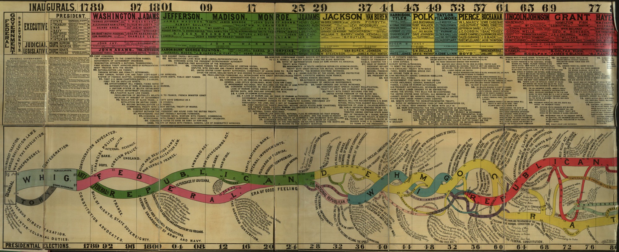
Timelines were very popular in the nineteenth century, in classrooms as well as living rooms. An intriguing example is this “Conspectus of the History of Political Parties” (1880). Created just after the nation’s centennial, it translates a century of political history into a single visual picture.

Click to open in new window.
I had never heard of a “conspectus,” which is a nineteenth-century term meaning “a comprehensive mental survey.” And that is exactly the idea. I have only reproduced the image here, and left out the extensive narrative that was designed to be laid out under the chart, which lists political events, Supreme Court decisions, and acts of Congress.
In fact, there’s so much detail that I wonder about the purpose of the chart. Perhaps the point was to collapse the chaos of change into a single view, one where a party’s power could be traced over time. The appeal seems to be to capture an overall state of change, of flux. Notice how much the chart resembles a a river. The metaphor is useful — the wider the river at any spot, the more “powerful” the party at that time. I’m particularly impressed by the representation of the turbulent 1850s, when the Whig Party disintegrated and the Republican Party was founded.

Click to open in new window.
I’ve discussed this and several other “maps of time” in chapters one and two of Mapping the Nation. And if you find that you just can’t live without a copy of this timeline, good news! Larry Gormley, owner of the fabulous company HistoryShots, has reprints of the 1893 chart. Not only that, he’s constructed a sequel for the twentieth century that is just as fascinating. You’ll be mesmerized!
The image here is from Walter R. Houghton, Conspectus of the History of Political Parties (Granger, Davis & Co., 1880), and lithographed by William B. Burford in Indiana. Many other strange and beautiful examples in the genre can be found in Anthony Grafton and Daniel Rosenberg’s Cartographies of Time.
Use controls to zoom and pan.
[…] Of Political Parties Posted at 8:45 on July 21, 2012 by Andrew Sullivan Susan Schulten found a fascinating timeline, created in 1880, of American political party history up to that point. She […]
[…] Parties,” an attempt to represent graphically just over a century of American politics. Susan Schulten introduces this interesting antique item at Mapping the […]
[…] about how maps can be used to describe complex, non-geographic topics: Mapping the Nation has reproduced a very map-like timeline of American political history from 1776 through […]
[…] Schulten found a fascinating timeline, created in 1880, of American political party history up to that point. She […]
[…] Mapping the Nation: Charting the Flow of Political Power […]
[…] via: http://www.mappingthenation.com/blog/?p=96 Share this:TwitterFacebookLike this:Like2 bloggers like this. Tagged Charts, Fuck the Whigs, Graphs, It's Science!, Learn How to Draw, Politics […]
It is interesting that in 1776 there were still maps being produced that showed California as an island.
Then again, at some time in the future history of the United States, after a major earthquake, it may become one.
I love old maps. Thanks for showing these.
about how maps can be used to describe complex, non-geographic topics: Mapping the Nation has reproduced a very map-like timeline of American political history from 1776 through
[…] Check out this fascinating (and incredibly detailed) timeline of U.S. political history, produced in […]
[…] presented this visulaisation in her book Mapping the Nation and gives the file on her website http://www.mappingthenation.com/blog/?p=96 The author is Walter R. Houghton, Conspectus of the History of Political Parties (Granger, Davis […]