Newly discovered anti-slavery map
Last weekend I was at the Winterthur Museum in Delaware for a symposium on historic maps. While there I met several map collectors and dealers, including Tom Hall, the curator for the large private Maclean map collection outside of Chicago.
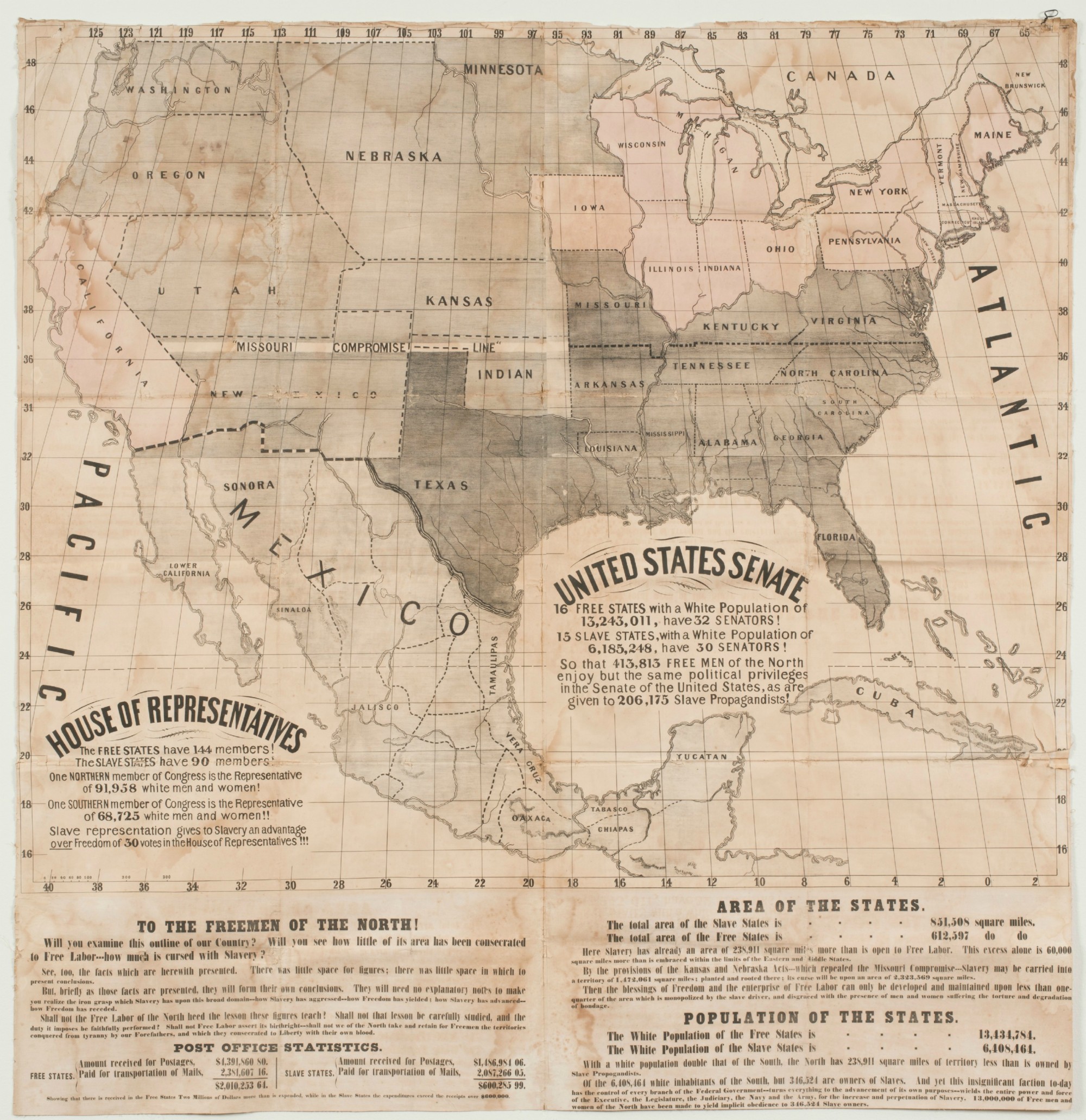
Tom showed me an electrifying map that closely mimicked several others I have written about from the height of the sectional crisis in the 1850s. The maps, though made independently, are all drawn to promote the Republican Party in the 1856 election, when that party ran its first presidential candidate. The party’s primary goal was to repeal the Kansas-Nebraska Act, which effectively opened the potential for slavery to extend into the American west.

Click to open in new window.
The map does not mention the Republican Party, but the message is clear. Notice the urgent language toward the bottom of the broadside exhorting northerners to organize against the “iron grasp” wielded by “slave propagandists.” As I’ve written in chapter 4 of Mapping the Nation, these exuberant maps were inexpensively printed in order to reach the widest possible northern audience. The goal was to recruit new (especially young) voters into the Republican Party as fast as possible.
Here, for instance, is another one with the same urgent call to mobilize against slavery. It measured about 2 feet wide by 3 feet, designed to be hung publicly. No matter what their size, each iteration of this anti-slavery campaign map uses the same data–expenditures on the mails, congressional representation–to show a nation that is controlled by slaveholders.
I’m struck by the sheer number of these anti-slavery maps from the 1850s. It indicates that the Party and its supporters embraced cartography to make their point about the geographic stakes of the election. For a population of varied levels of literacy, such stark pictures of slavery seemed to make an undeniable impression. And as I’ve written in chapter 4, these maps are also part of a larger history of cartography that gradually embraced statistical mapping to make sense of population distribution, here starkly represented as either free or slave.
The unusual aspect of this particular anti-slavery map is its size: while the others I’ve examined are the size of newspapers, pamphlets, or slightly larger, this one is nearly five feet square! It was clearly designed for a large public space, such as meeting halls across the north where opposition to the Kansas-Nebraska Act eventually coalesced into a new political party that would capture the White House in 1860 with the election of Abraham Lincoln.
Thanks to Tom Hall and Barry Maclean for sharing this remarkable and very rare example of anti-slavery cartography.
Use controls to zoom and pan.