
New book on Emma Willard!
This is a long overdue notice that I’ve published a comprehensive account of Emma Willard’s maps of time. These include time lines, graphic visualizations, and maps, all done with her characteristic c...
Here we can continue to explore the relationship between maps and history. I welcome your comments, and your maps!
This is a long overdue notice that I’ve published a comprehensive account of Emma Willard’s maps of time. These include time lines, graphic visualizations, and maps, all done with her characteristic c...

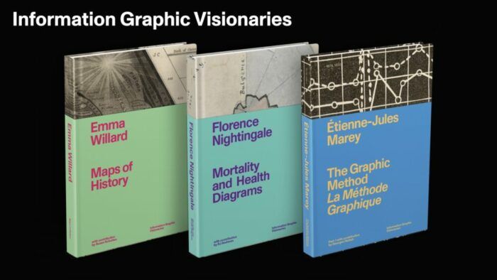
This week I had the privilege of posting a story for the Public Domain Review on Emma Willard, one of the most influential educators in the nineteenth century. For decades, Willard dominated the textb...

This week marks the hundredth anniversary of the Treaty of Versailles, signed on June 28, 1919. From January to June, the great powers met at Paris to replace the imperial order with one that reflecte...

My new book, A History of America in 100 Maps , has been featured in a variety of media outlets recently.

In 2016, the Beinecke Library at Yale University paid $100,000 to add Elmer Simms Campbell’s energetic profile of interwar Harlem to its celebrated collection of black history and culture. The Library...

I’m proud to announce that my new book– A History of America in 100 Maps –is now available in the US! It is co-published by the British Library Press and the University of Chicago Press. The British e...

On April 20 I was privileged to be one of the speakers to open the David Rumsey Map Center in the Green Library at Stanford. The facility is fantastic — a spacious library with every kind of digital t...

Cornell University has just posted an online collection of “persuasive” maps owned by Paul J. “PJ” Mode, who has been building this collection for years. Some might describe these as “propaganda” maps...

In April I was privileged to deliver the Vorhees Lecture in the History of Cartography at the Library of Virginia. Our theme was Civil War mapping, and the Library organized a wonderful one-day exhibi...

This week the University of Denver will open an exhibit of pictorial maps drawn from the private collection of Wes Brown. The exhibit is curated by Rebecca Macey, and located in the Anderson Academic ...

From the mid-1880s through the 1890s, reformers in San Francisco, Chicago, and New York experimented with maps to make sense of an exploding immigrant population. Considered together, what might these...

On December 22, 1864–150 years ago this week–Sherman telegraphed President Lincoln a brief but powerful message, “I beg to present you as a Christmas gift the City of Savannah.” Sherman had cut loose ...

We’ve just survived another election season, with the attendant (and often hyperbolic) claims that the nation’s future hinges on the outcome. In the aftermath, it seems fitting to recall another campa...

In the archives of the American Antiquarian Society lies a strange and captivating map with an even more unlikely story. The map dates to 1838, though this copy was printed five years later. At first ...

I’ve been preoccupied lately with student manuscript maps, generally made by girls between 11 and 18 attending one of the many female academies of the American northeast between 1800 and 1830. “Map st...

We live in what is endlessly described as an era of unprecedented partisanship, with Americans polarized into red and blue camps and no convergence in sight. But much of the nation’s history was chara...

In the decades after the Civil War, Americans rushed headlong into the west. By 1890 Kansas and Nebraska had over a million inhabitants, and over six million lived in the seventeen states and territor...

More Americans came into contact with maps during the Second World War than in any previous moment in American history. From the elaborate and innovative inserts in the National Geographic to the sche...

Lincoln Mullen has just posted a wonderful interactive map of slavery in the United States. His inspiration begins with the 1861 Coast Survey map of slavery, which identified the ratio of slave to the...

One of the most intriguing cartographic developments in the nineteenth century was the effort to map the past. Experiments with historical mapping can be found in the eighteenth century, but the sprea...

On February 25 I delivered an address on the University of Denver campus to commemorate the 150th anniversary of our institution. My goal was to go beyond the history of the university and instead tel...

In early January I had the privilege of visiting the map collection of “PJ” Mode in New York City. PJ has acquired hundreds of maps around the theme of persuasive cartography. The collection includes ...

A vivid exhibit of maps made in Boston in the century prior to the Revolution is open through March 10, 2014 at the Boston Public Library’s Leventhal Map Center.

This week the Digital Scholarship Lab at the University of Richmond has unveiled its latest project , a digital version of the landmark Historical Atlas of the United States, published in 1932 under t...

Last month I presented a paper at the Nebenzahl Lectures on the History of Cartography in Chicago. My subject was cartographic innovation during the early American republic — essentially the 1790s to ...

Last weekend I was at the Winterthur Museum in Delaware for a symposium on historic maps. While there I met several map collectors and dealers, including Tom Hall, the curator for the large private Ma...

Last week I was delighted to find what I believe is the earliest American attempt to chart patterns of climate and its effect upon agriculture and vegetation, drawn by Simeon DeWitt in 1792.

David Rumsey has uploaded a rare 1885 map of San Francisco that represents the height of the anti-Chinese movement in California. The map accompanied a lengthy report of the city’s Board of Supervisor...

My last post examined a map of Georgia and Alabama made by the Office of the Census during the Civil War, located in the National Archives. This map of Louisiana was made by the same office at the sam...

I recently came across one of the earliest attempts by the Superintendent of the Census to incorporate census data onto a map, made during the Civil War.

A few weeks ago I was working through the massive 1883 Statistical Atlas of the United States,and found what I believe is the first attempt to map election returns in the United States. The map is bas...

In the spring of 1863–exactly 150 years ago–the Coast Survey was in the midst of an effort to comprehensively map the rebellion on a series of regional maps at a scale of 10 miles to the inch for use ...

This week the University of Denver will open its remodeled library, although the building has been renamed the “academic commons.” The new space is beautiful, and will include an exhibit devoted to hi...

Recently I wrote a piece for the Disunion series on Edward Atkinson, who creatively used a map to demonstrate the inefficiency of slave labor.

Several people have sent me this population map , made by Brandon Martin-Anderson, which represents one dot for each person counted in the 2010 U.S. Census. The link takes you to an interactive and zo...

This past week I wrote a piece for Fast Company Design about the legacy of Francis Amasa Walker. As the Superintendent of the 9th Census in 1870, Walker took the Census in new directions. He proposed ...

On November 12th I was lucky enough to catch the opening of the new Civil War exhibit at the Library of Congress. Thanks to the curatorial work of Ed Redmond (of the Geography and Map Division at LoC)...

I just saw Steven Speilberg’s film “Lincoln,” and was amazed by the space given to maps on the set. The maps are never referenced directly, for the plot of the film is the passage of the Thirteenth Am...

In late October I gave a talk at Syracuse University, and was honored to have Donald Meinig in the audience. Meinig’s four-volume The Shaping of America (Yale) is written from a geographical perspecti...

Next week I am speaking at Middlebury College, which reminded me of a charming document I came across a few years ago: the 1828 penmanship journal of Frances Henshaw, located in the David Rumsey Map C...

Last April, CSPAN taped a lecture in my Civil War course for its “American History TV” program. The lecture aired this weekend, and I was heartened that people would actually watch a 90 minute lecture...

I have a piece today in Fast Company Design about the nineteenth-century origins of modern infographics, both thematic maps but also other forms of graphic knowledge like timelines.

Could the map of the west have been drawn in a fundamentally different way?

Jon Dotson, owner of Old World Auctions , recently showed me a political broadside from the 1856 campaign, when the new Republican Party ran its first presidential candidate, the celebrated western ex...

In late July I gave a lecture on early maps of what eventually became the Colorado Territory, as part of a conference hosted here at DU on the mapping of the west. I used the following map to illustra...

I have a piece in today’s “Disunion” blog at the Times on Private Robert Knox Sneden, a soldier with artistic talents who was attached to the Third Corps of the Army of the Potomac throughout 1862.

John Delaney, a curator of the Historic Maps Collection at Princeton University Library, has created an excellent online exhibit of thematic maps (it may take a minute to load). In it he traces the or...

Timelines were very popular in the nineteenth century, in classrooms as well as living rooms. An intriguing example is this “Conspectus of the History of Political Parties” (1880). Created just after ...

This is one of the earliest maps made in the new nation. In 1790 the first Postmaster General appealed to Congress for funds to create a comprehensive map of the postal network. Existing maps were ina...

Thanks to Wendel Cox, senior manuscripts librarian at the Denver Public Library, for sending me this map issued by the Denver Planning Commission during World War Two. This unconventional world map ce...